Sunday, 31 October 2010
Analysing the audience research
In question 1, it starts off with gender which again shows up that it was equally shared amongst girls and boys.
Question 2, highlights that the age range who participated the most were 17-18 years old with a few 15-16 and 19-20 years old also. This enables us to get a better understanding towards the common age in which young adults begin to have access within cinemas and DVD rentals to films rated 18.
Question 3, Allows us to know that our audience enjoys special effects which is expected from young adults in this day and age, we have taken this into consideration that young people like more exaggerated films in which alot of action happens and gets these effects running rapid throughout things, which is an interesting recollection to take on board when it comes to editing our footage.
Question 4, has a good correlation in the most picked answer. Film in colour was picked most which understanding as everything in this day is in colour and it becomes harder for people to like more into the black and white era. However they was a vary of people whom picked both meaning that they have enjoyment in which ever contrast is being given into a film.
Question 5, This had the most varied answers within the whole questionnaire where every answer was picked at least once, the favourited answers for the horror sub-genre was comedy and thriller, Religious thriller horror is what our group came up with as it connects well with our story line and allows us to include many things which we have uncovered that the audience likes e.g. suspense, tension and mystery along with blood and gore.
Question 6, The length of our trailer is very important as we wouldn't want to cut it off too short not giving the audience enough to be excited about or having it to long giving away too much and boring them. The overall result was 30-40 seconds long in length, which we agreed is acceptable.
Question 7, We found that the majority of people want to see this trailer after 9pm which works within our favour as it wouldn't breach any codes for the watershed, even though we haven't to a final decision to what our rating for this film will be.
Question 8, people believed that swearing in horrors isn't necessary which could possibly be inflicted by background, religious beliefs etc.
Question 9, The male villian in a horror was picked more over a female by the participants possibly because of the use of males in todays society as the bad guys whether in horror or action or sci-fi, relatively women are unfortunately seen as weak and the audience may view a female being a villain not as scary or effective as a man would.
Question 10, The internet was picked highly above all others as the source that gets people alerted for new up and coming films, we can use this to our advantage by advertising on facebook, twitter and any other social networking sites that will exploit our film to the public.
Question 11, 25 people chose 'yes' for having background music, which informs us as a group when editing to incorperate this in the trailer appealing to our target audience.
Question 12, Colours in films and posters are an important factor to observe on. When doing horror the common colours that repeately show up is red and black. From this knowledge it wasn't surprising finding out that most favourable one to use within our film poster was red and black being the 2nd favourite. Dark colours embrace the eerie feelings for horror films which will make it more effective and enjoyable by our audience.
Question 13, In most teaser trailers there is an extensive use of sound effects which grabs the audiences attention and keeps this intrigued to what will happen throughout the rest of the film. We as a group decided that we will go with what the audience has demanded and put several effects in our overall trailer; this may include screams, a sound of a drill and many others that we might come across.
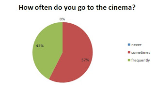
Question 14, The majority of people who done our questionnaire go to the cinema. This allows us to know that if advertisement were needed to be done, the cinema would be an effective way to do it. It connects to the previous question about the best way to be alerted about a film.
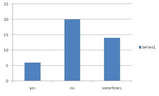
Question 15, Again to the previous question it helps us when coming to the advertisement aspects of producing a film. However it narrows it done to whether it would be worth alerting cinemas on the new film and evidently have no-one come frequently within the week to actually see it.
Question 16, Dialogue in teaser trailers vary and we thought that it would be a good idea to get information from our audience to whether it is helps them understand what is going on in scenes. Just as we expected, we discovered people want dialogue to be included so we will try and get some in our trailer.
Question 17, For our film magazine we took this response confrming that actors who are known from the film being on a cover will attract an audience into purchasing it, when discussing the design we will take that into consideration whilst doing the drafts.
Question 18, From the response of this question we see that people chose £1.50-£2 however that would hardly be possible because of the costs in producing so we have decided to make it from a reasonable amount of £3+
Question 19, Props in horrors are a usual convention which is used throughout different type of horror sub-genres. It pleases the group to know that our audience is prone to the use as we intend to use them in our trailer.
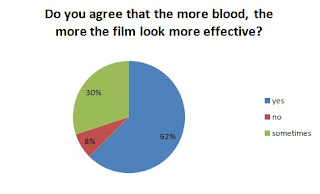
Lastly, Question 20 The more blood is seen to make a horror more effective according to our audience but of course we need to make sure that if we decide to take the route of alot of blood in our shots that it doesnt conflict with other subgenres of horror e.g. splatter , other than the one we have already posititioned ourselves into (Thriller)
Saturday, 30 October 2010
Friday, 22 October 2010
Storyboard
Leyla's Textual Analysis of Nightmare on Elm Street poster
 The lighting is low key, and the only visible white light is on the prop of the glove, because the Nightmare on Elm Street films are so famous, the glove and costume i.e. the hat act as a title and denote it’s a Nightmare on Elm Street film just by looking at the costume and prop. Although the lighting is low key, you can see Freddie’s face, the make up used shows a burn face which again connotes fire. Because this is such a close up shot, setting isn’t apparent, a red glow is seen from behind which connotes fire and heat. The way in which Freddie is holding his hand up can be seen as a representation of him about to attack someone. The only text used on the poster is the ‘2010’ and the website, both written in a font that links in with both the colour scheme and scenery because the font itself looks charred. This works well as a teaser poster because of how little information is shared with the audience, this then makes the audience research about the film because they know so little about it
The colours red and orange are used heavily in this poster mainly because these colours connote fire. Fire is the cause of the main character, Freddie Kruger, wanting revenge. The lighting is low key, and the only visible white light is on the prop of the glove, because the Nightmare on Elm Street films are so famous, the glove and costume i.e. the hat act as a title and denote it’s a Nightmare on Elm Street film just by looking at the costume and prop. Although the lighting is low key, you can see Freddie’s face, the make up used shows a burn face which again connotes fire. Because this is such a close up shot, setting isn’t apparent, a red glow is seen from behind which connotes fire and heat. The way in which Freddie is holding his hand up can be seen as a representation of him about to attack someone. The only text used on the poster is the ‘2010’ and the website, both written in a font that links in with both the colour scheme and scenery because the font itself looks charred. This works well as a teaser poster because of how little information is shared with the audience, this then makes the audience research about the film because they know so little about it
Thursday, 21 October 2010
Leyla's Textual Analysis of A Nightmare on Elm Street Trailer
The trailer starts with a quite derelict street full of rubbish, clutter and abandoned warehouses. There is fog and clouds so this gives the shots a very blue tint throughout, the camera cuts to different parts of the street to show broken abandoned vehicles and more clutter such as broken pipes, piles of scrap metal and planks of broken wood, this connotes that no one has lived there for a long time. A slight on going noise is heard that sound like a faint hum, then the character of Freddie Kruger emerges being chased by a number of different cars with their headlights on. As he comes forward, the sound of a car back firing or a loud booming noise is heard. NVC is used when a close up shot of Freddie Kruger shows how scared he is. Sounds of the cars engines and sounds of the wheels spinning and skidding are then heard. There is a cut that gives a POV shot from the drivers of the cars. Non- diegetic fast passed music is then heard as Freddie Kruger runs into an abandoned building. A male character then says ‘Kruger’ as Freddie locks himself into the abandoned building, the tone used in the mans voice connotes anger.
When narrative starts of a girl talking, it cuts to an older teenage girl standing in a bedroom covered in snow; through NVC you can see she is confused. It cuts back to black again then cuts to another girl walking down a hallway this time with her narrative; the camera is behind the girl as she walks. There is then a cut to a black room with pipes on the wall with orange light and the figure of Freddie Kruger standing so that his silhouette is visible. Non diegetic organ sound to build tension is heard as the light flickers and Freddie moves slightly. It cuts back to black. More organ sound is played as the street sign of ‘Elm Street’ is shown. Again it cuts to black and the voices of children are heard starting to sing a nursery rhyme, it then cuts to the street at night; this connotes how Freddie kills at night because this is when the teenagers are asleep. There is then a shot of candles which connotes the fire. Then a shot of two teenagers around some fog which connotes the fog on the day Freddie was killed. It cuts to black again. And the singing stops and a sweeping non diegetic noise is heard and it goes silent. Fast passed non diegetic music is heard then the glove of Freddie comes up with him scratching along the pipes making sparks. Lots of quick cuts and the non diegetic singing of the children follow. A shot of a funeral denotes the death of one of the teenagers. Dream sequences of the teenagers follow, many of the cuts being in slow motion, diegetic screaming being heard. The cuts get quicker and the non diegetic music gets louder. The main colours of the settings being blue, orange and black throughout all the cuts; it then cuts to the title in the same font as before in red. Then a final shot of Freddie threatening one of the teenagers before it cuts to black and the date of release.
Shooting script
Scene 1
Setting: IN A CHAPEL
Dialogue: None
Soundtrack : Created from Logic Pro
Prop(s) : Bible
Lighting : High Key
Scene opens with Medium long shot of a female walking a bible in her hand, As she is walking the camera is tracking out to go along with her movements.
Scene 2
Setting: IN A CHAPEL
Dialogue: None
Soundtrack : Created from Logic Pro
Prop(s) : Bible
Lighting : High Key
Scenes fades in with a mid-shot of a female then tilting down slowly towards the bible on her lap.
Scene 3
Setting: IN A CONFESSIONARY
Soundtrack: Created from Logic Pro
Prop(s) : Cardboard created confessionary plank
Lighting : Low Key along with use of orange gel light
A new scene with the female in a close up shows her in a confessionary.
Female : ( Leans head down)
Forgive me father, for I have sinned
close up of priest
Priest :
Fear not my child, salvation is here
Blackout
(Scream from female)
Multiple shots of female covered in blood and wounds


